


ETV - BRAND IDENTITY
A wholehearted and trusted partner of your business.
A wholehearted and trusted partner of your business.
CLIENT
ETV is a brand that was founded on November 9, 2018, and it specializes in consulting and offering services like inspection of materials, machinery, and equipment that must meet tight guidelines for occupational safety. In addition to monitoring the working environment in Vietnam, other services include measuring instrument testing and calibration, occupational safety and health training, and consultation on the development of safety, health, and environmental management systems for businesses.
ASSIGNMENT
Makeover the brand by altering the logo and redesigning the different internal communication materials. Establishing a voice that could express the brand's future-focused outlook and accessibility.
SOLUTION
We changed the way the brand communicated with consumers by using a new, daring, yet universally understood language. Dusting off the brand was achieved by adopting a completely new brand palette, using modern and contemporary typography, and creating new and powerful communication designs (a brand manifesto, a new format for a communication campaign, a series of product posters, and several other collaterals).
PROCESS
Redesigning the brand; creating a new brand book; creating new communication materials, redesigning the previous ones, and creating everything from stationery to in-store printed materials.
We hope you have a wonderful viewing experience as we showcase this project as Brand Guideline.
BRAND ELEMENTS
The ETV identity comprises a series of elements that, when used together, create a cohesive look, feel, and tone that embodies our brand idea, “Welcome to real learning, for real change.”
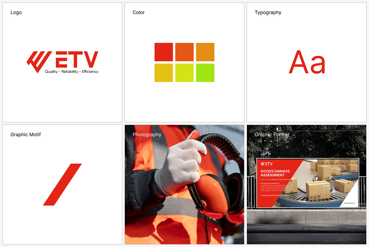
LOCK-UP
The ETV lock-up is comprised of two parts, the logo wordmark and the tagline. In select instances the logo alone can represent the brand, but caution should be exercised to ensure viewers are either.
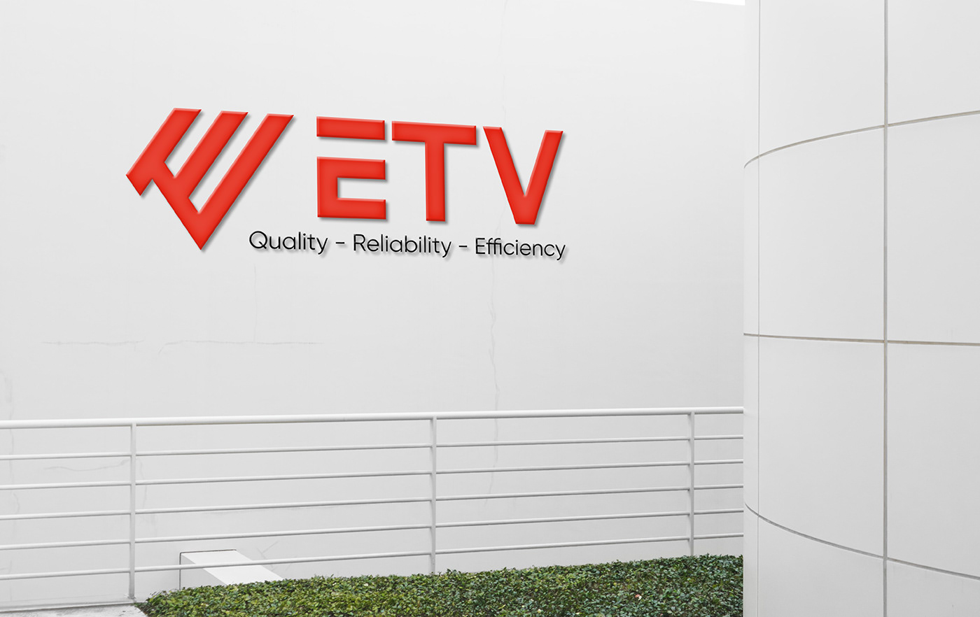
LOGO
Our logo is the shorthand for our brand. It’s distinct, memorable and works well at a variety of scales and mediums. We use our symbol in a variety of ways, from opening a piece of communication to a simple, elegant sign-off.

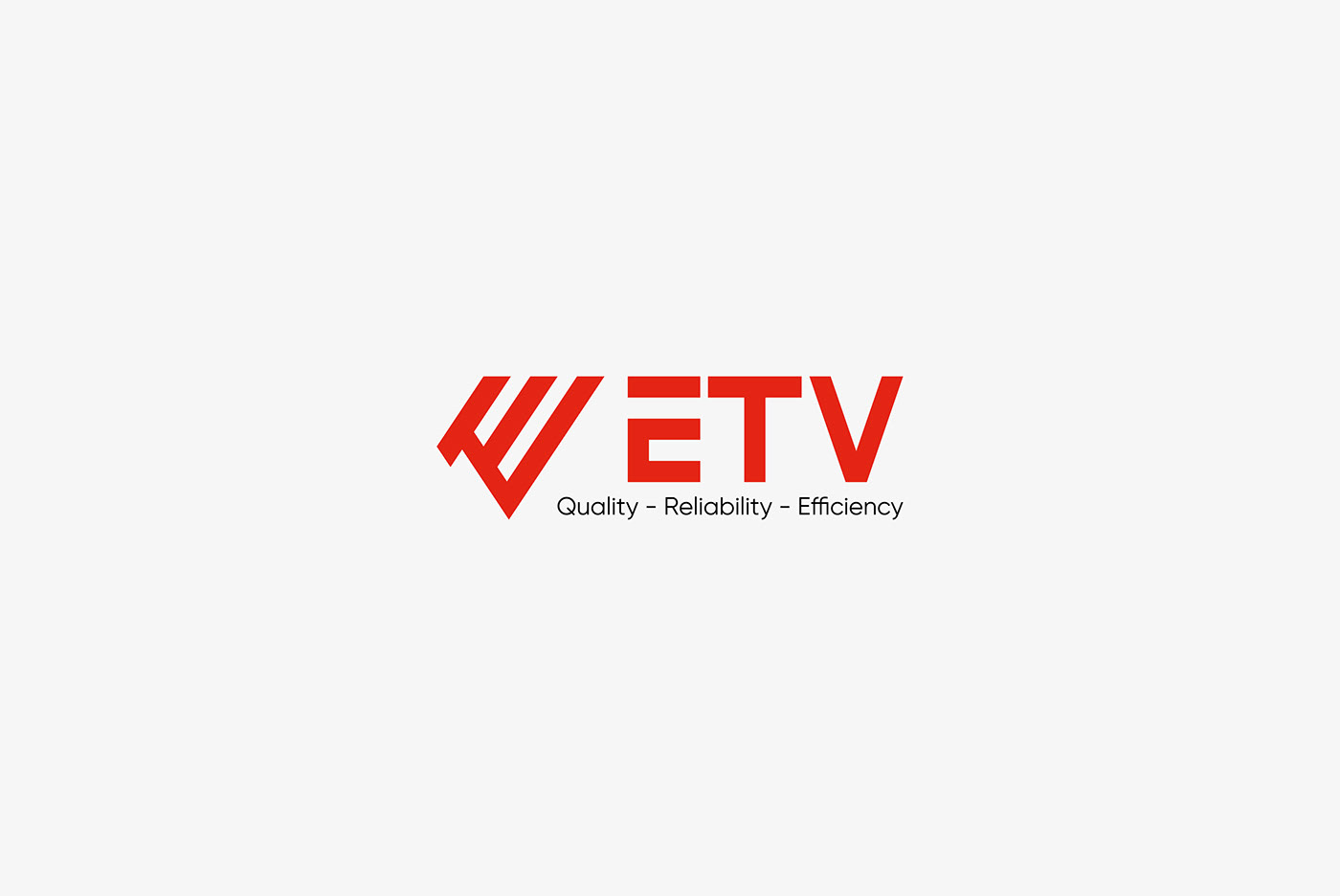
WORDMARK
The ETV logotype is made with solid, straightforward, easily readable geometry that is bold, clear, and uncomplicated. When the crossbar is removed, the letter E is given a little more importance. The ETV word cluster is constantly recognizable and able to stand alone on other applications thanks to this highlight.

MEANINGS
It was necessary for Vivian Creative to come up with a brand name for ETV that was powerful, versatile, and easy to remember. Following debate, we decided to employ the Monogram Logo design choice to tell the tale of ETV's development and striving. The emotive significance of a monogram logo design is what makes it intriguing; the arrangement of the letters creates enduring acronyms and a stronger bond with the business name. The 3D shape geometry is applied bluntly to the letter E. Stability and solidity, directionality, and a host of other activities are created by the balance provided by the two TV figures nestled on top of each other in a simple construction.
In order to communicate a contemporary, streamlined identity and aid in sharpening the emphasis on the message that the ETV want to get across, layout components are constructed using visual elements that speak to the viewer through the languages of geometry, color, layout, space, and narrative.

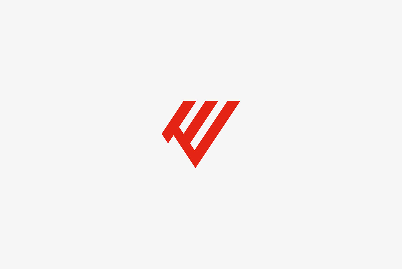
LOGO CONSTRUCTION
In order to make the default logo consistently presented across the platform, we adjust the logo constructions starting from tilt and kerning between logotypes for readability.

EXCLUSION ZONES
The exclusion zone ensures the legibility and impact of the logo by isolating it from competing visual elements such as text, graphics and imagery. The diagrams show the correct amount of space that should surround the logo. No accompanying text or logos should appear in this area.
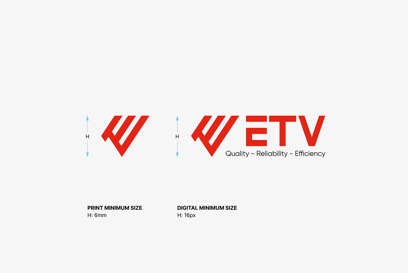
SCALE
In order to keep the form and readability, we decide the smallest size for digital and print media.


FREESPACE EXCEPTIONS
We use our brand icon as our primary symbol on social and across other digital touch-points. Our icon is designed to work successfully in whatever shape it is required to fit within, whether it be circle or square.

LOGO COLOR
While the ETV logo and lock-ups can be used in any of our brand colors, they should always appear in monotone with a strong preference for use in crimson or tango.

COLOR
Color is one of the most recognizable parts of the brand. It can become t he one single element that people relate to in ETV collateral. Crimson and Tango are the primary brand colors. The combination within a layout should always include one or both primary colors. While the Golden Bel, Barberry or Gold Tips, Inch Worm visual depth and brand recognition, the Black & White adds lightness and space, and the supportive colors individually contribute to a modern and dynamic expression.

TYPOGRAPHY
Inter is ETV's corporate typeface that transmits uniformity and harmony in its global uses, contributing to the consistency of ETV's brand image.
GRAPHIC MOTIF
Our graphic motif, akin to our brand identity, narrates a vibrant and timeless tale, conveying our purpose-driven journey to our audience. Each design iteration is meticulously crafted from elements of our logo, symbolizing our cohesive narrative. Our graphic motif not only embodies our progressive ethos but also celebrates the unique essence of our community. Every variation of the graphic motif promises an engaging narrative and enriches the depth of our storytelling.
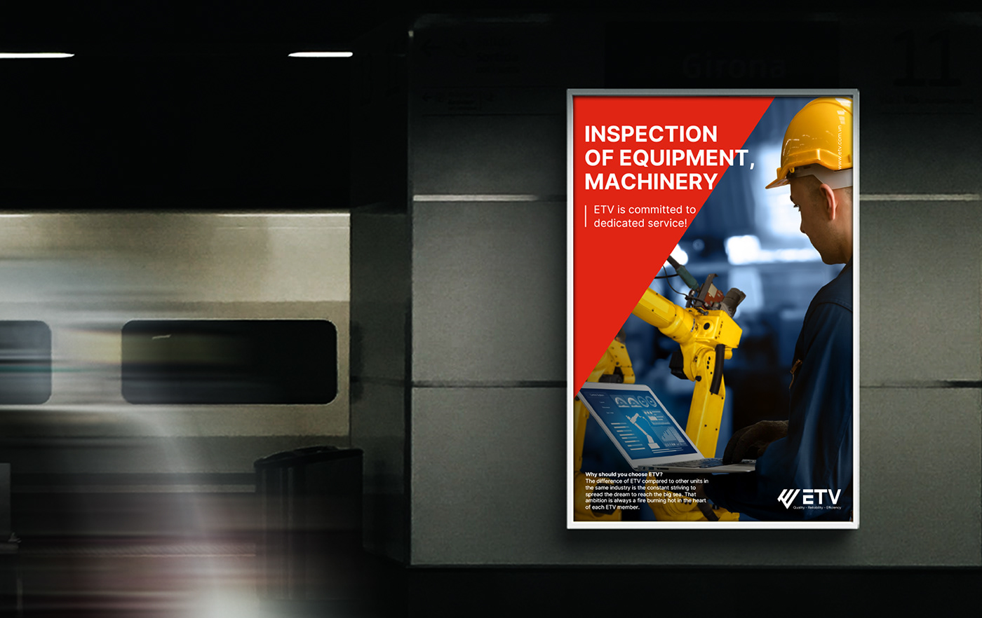


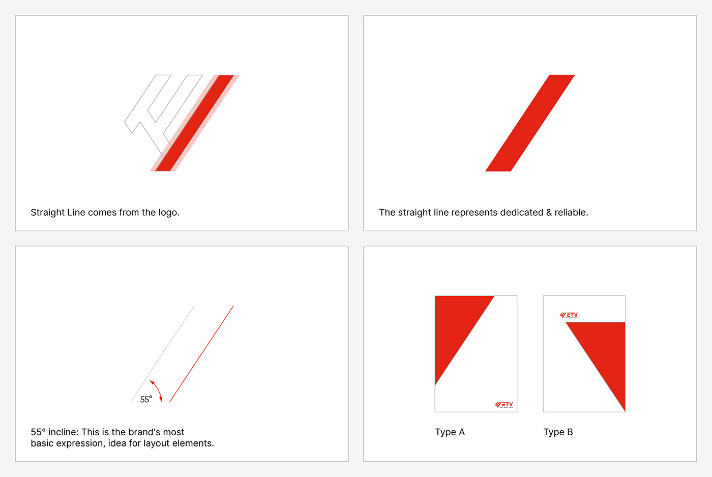
GRAPHIC FORMAT
By utilizing the geometrical straight line of the ETV in our logo, we create a graphic format that gives the brand clear recognition in both printed and digital channels. It is used throughout the entire identity tying all applications together. It can be applied to one or two corners of an image or graphic shape. The size of the radius can differ depending on what kind of application it's applied on.
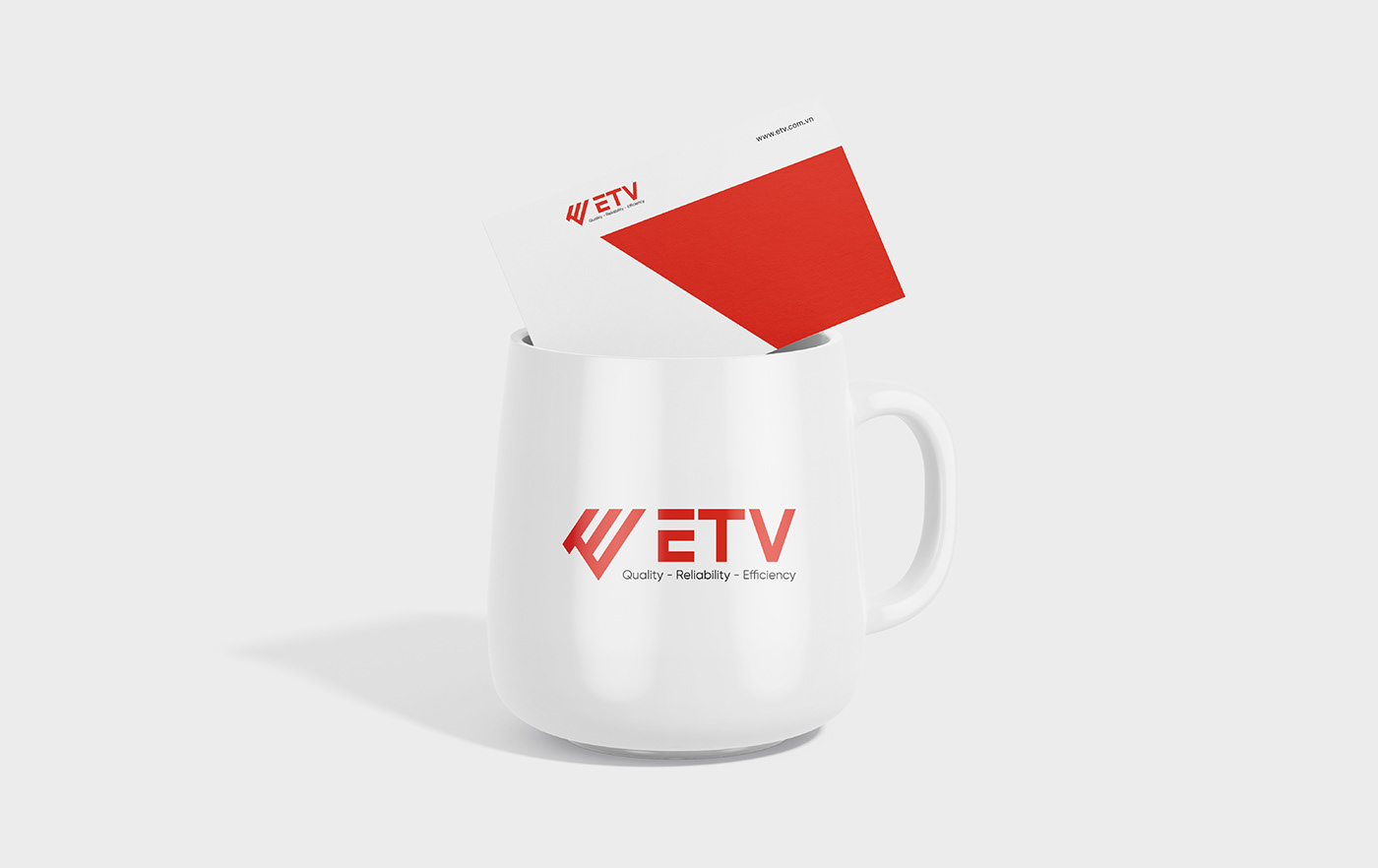


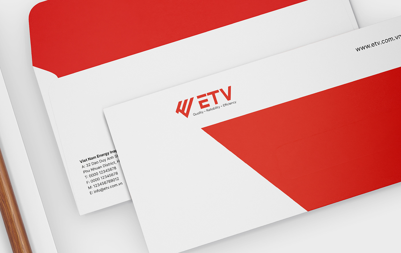


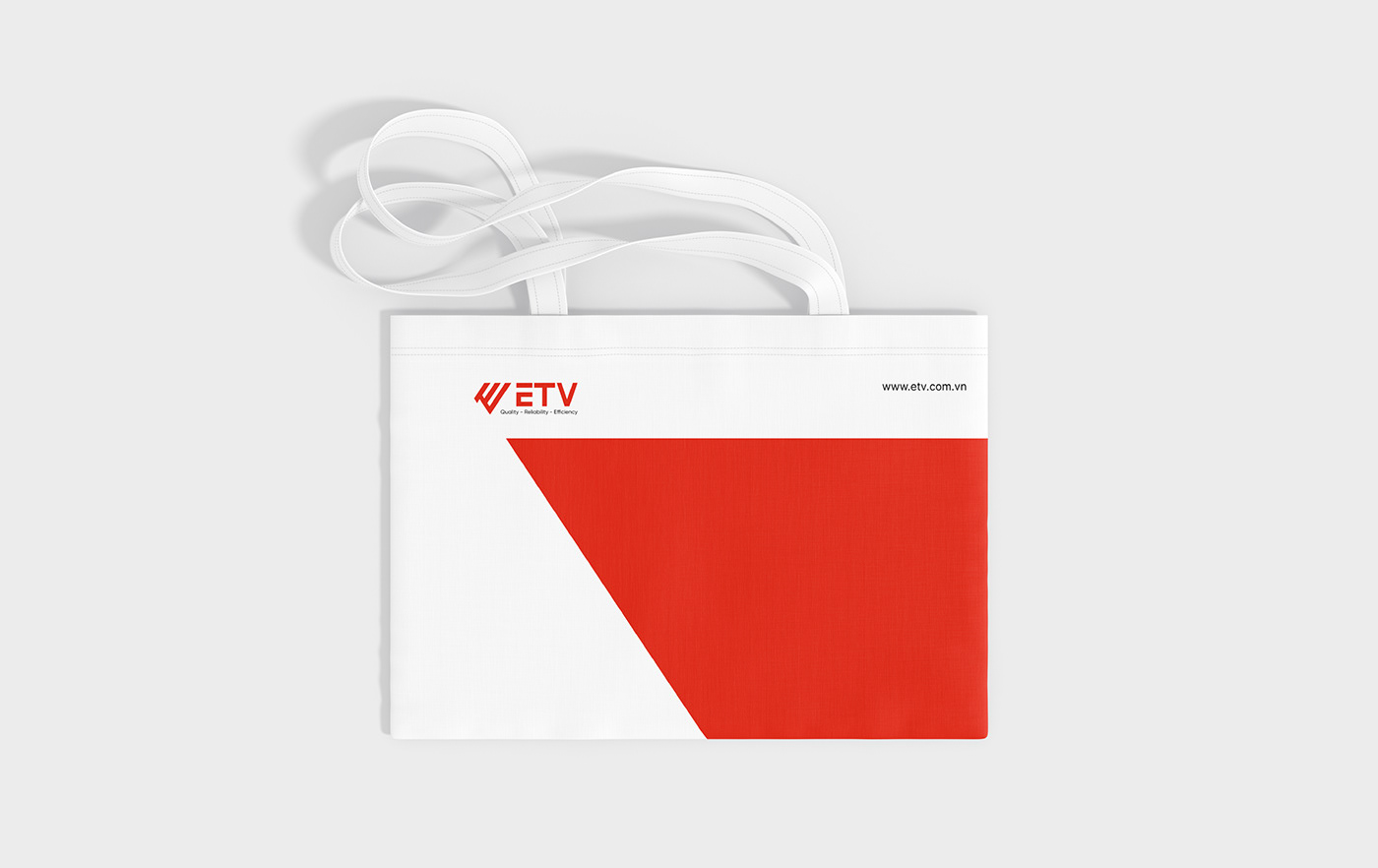


STATIONERY SPECIFICATION
Stationery is an integral part of ETV visual identity. Our supergraphic is a close cropped section of our identities which bring more emphasis to the dynamic built within these straight line. With the help of supergraphic, stationery items can then strengthen our brand present, reflect the spirit of the company.
Credits:
Client: EIC
Branding Agency: Your Designer
Creative Partner: Vivian Creative
Brand Designer: Tran Ngoc Tan
Thanks for watching, if you liked it, appreciate below!
Wherever you are in your branding journey, we’d love to hear from you.
Get in touch and tell us about your project.
www.vivian-creative.com I info@vivian-creative.com
© Vivian Creative. All Rights Reserved


